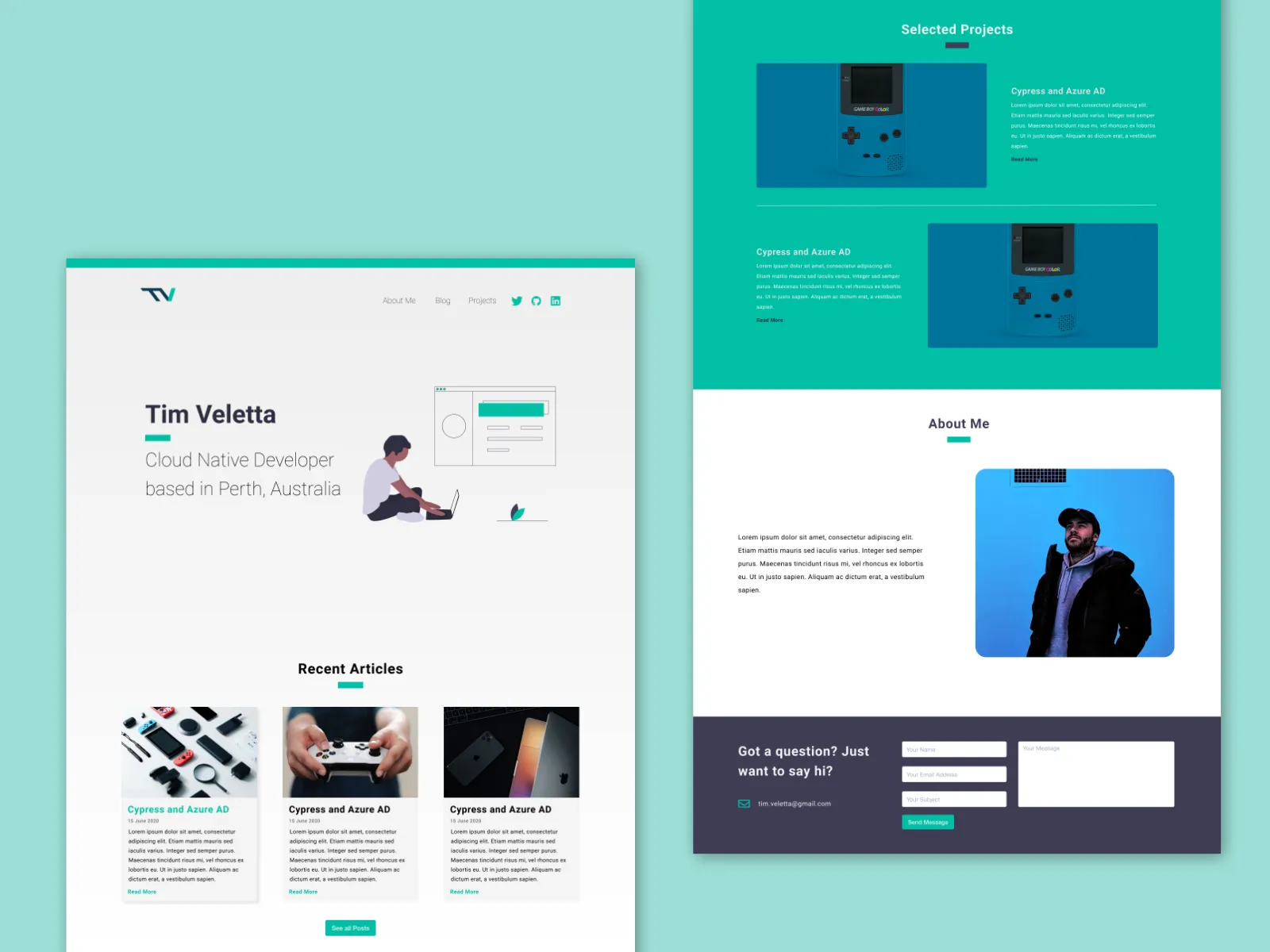
Refreshing my blog with Netlify CMS and Tailwind CSS
I has come time for my annual website redesign and refresh. You’re probably thinking, why bother redesigning your website every single year and to be honest, it’s not really intentional; it just takes me about a year to get sick of the design enough to want to redo it.
Some other reasons for rewriting my website this year include:
To learn more about Netlify CMS and Tailwind
I have been wanting to learn more about Netlify CMS for some time since I believe it would be useful tool to build sites for independent contracting work. One of the issues I commonly run into with independent contracting work is where the content of the site is managed and because I’m typically short on time, that content often is stored within the code. This makes it difficult for the client to make changes to the content without having to engage me taking up my free time for a relatively minor change.
Netlify CMS provides a simple, configurable Content Management System (CMS) on top of Netlify, that makes it easy to manage site content without having to edit code or assets. So for further client projects, I can develop the layout and functionality of the site before educating the client on how to modify the content through the web portal.
The other tool I wanted to better understand was Tailwind. Tailwind is a CSS framework that gives you many blocks to build layouts without being too opinionated on how you should structure your components. What I really enjoy about Tailwind is that it makes styling a website predictable so rather than fighting my CSS to understand why some small change is breaking my whole layout; I know that my component is going to look like what I expect it to look like.
The makers of Tailwind CSS also put together a book full of small tips that help developers better understand design, called Refactoring UI, which ties in nicely to a lot of the principles Tailwind is built upon.
Make blog content key
One of the things I disliked about the old design of my website is that blog content was a very low priority, both in terms of visual hierarchy and actual effort. In the past year, I’ve written 3-4 blog posts on my site, only one of which I am actually pleased with. I decided to remove a lot of blog posts in an effort to make the content on here a lot more technology focused and relevant to the type of people that arrive on my website.
Also since I am going to be writing some additional blog posts for my employer and other external sources; I wanted to be able to showcase those posts on my own website and link to them which I was able to do easily with Netlify CMS.
Continually practice and improve design skills
Lastly, rebuilding my website was about being able to practice and improve my design skills. A majority of my “design work” previously has been taking inspiration from a number of sources and trying to make something somewhat unique. Designing my new website was no different; I had a number of inspirations which I collected in this Dribbble album which ultimately inspired the overall design.

As for next steps, I still want to add an area to my website which showcases some of the projects I have worked on but for now blog content is king. I’m looking to write at least one blog post a week as I learn more about the AWS Cloud Development Kit (CDK) and AWS Amplify.
